Rowlock House Extension, Reading

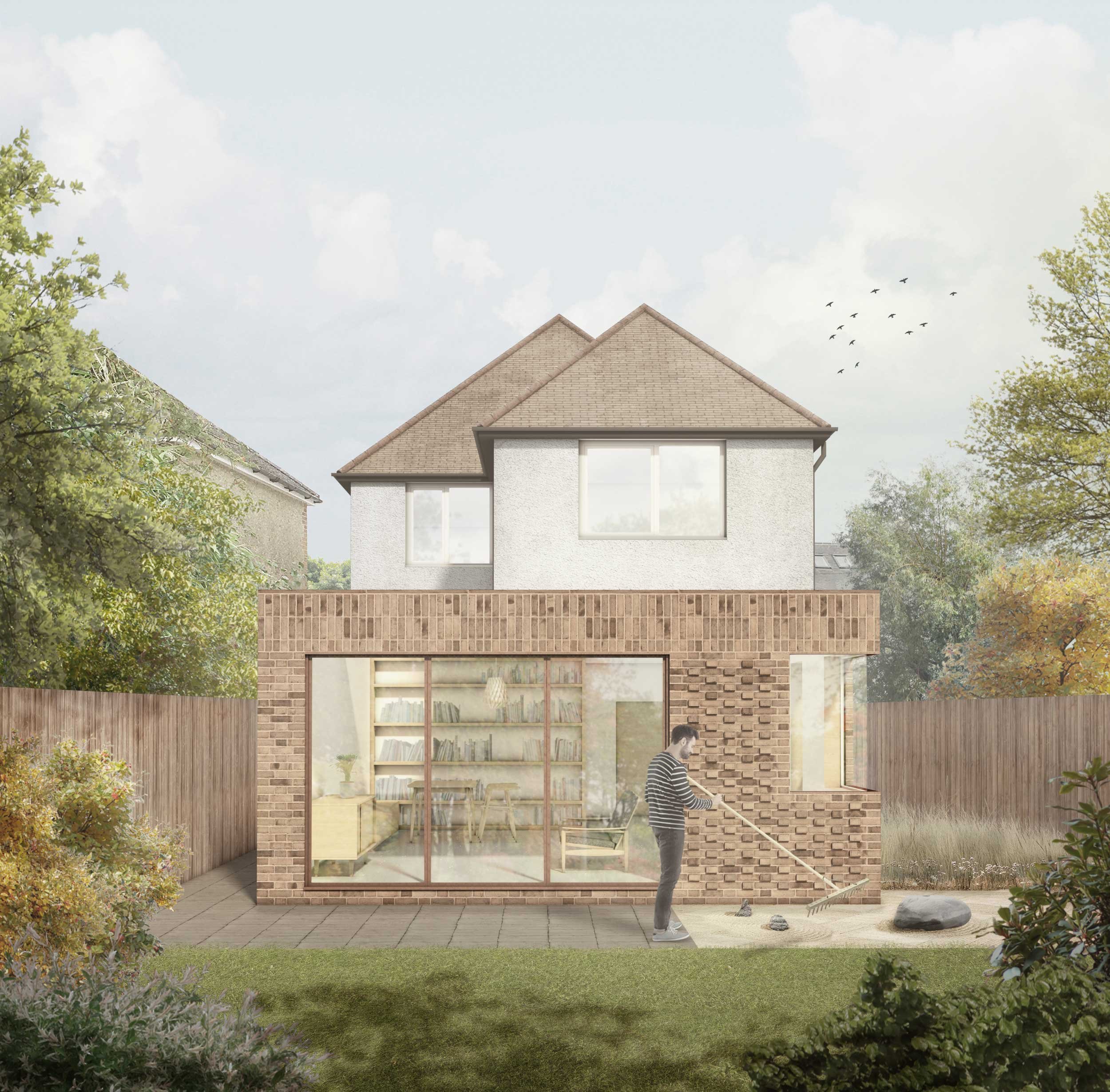
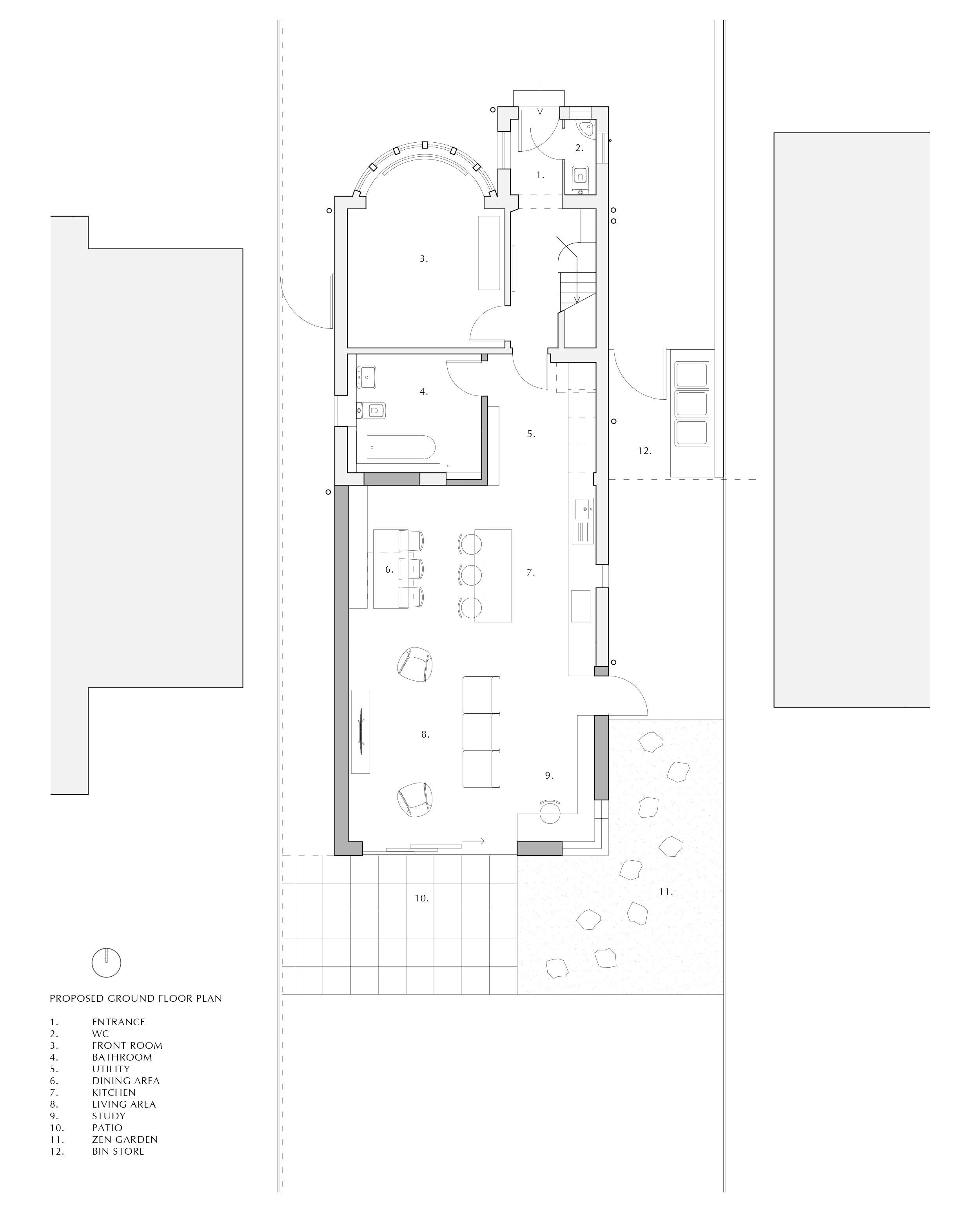
A single storey contemporary house extension focusing on brick detailing to reflect the repetition and simplicity of a zen garden, providing a light and open living, dining and study area.
The house is situated in an area of 1930s suburban sprawl with good connections into the nearby city centre of Reading. Our clients were in need of a spatial refinement and with our help as architects, opted for an open-plan living setting surrounded by natural light. This challenged us to overcome the possible aesthetic obtrusion of extending an existing two-storey building to prevent it appearing too cumbersome. By mainly focusing on rearranging the internal partitions and extending out at ground floor level, it provided an opportunity to introduce a wash of natural light deep within the inner spaces.
The existing house has a brickwork string of stretcher and protruding header coursing which forms a detailed stop for the render above. Our design captures and continues this original detail, fashioning a modern intervention of soldier and rowlock coursing to encase the ceiling depth behind, a deliberate characteristic that references its context. The lower section of flemish bond wraps around the new extension and includes elements of protrusions that denote repetition in the existing brick string.
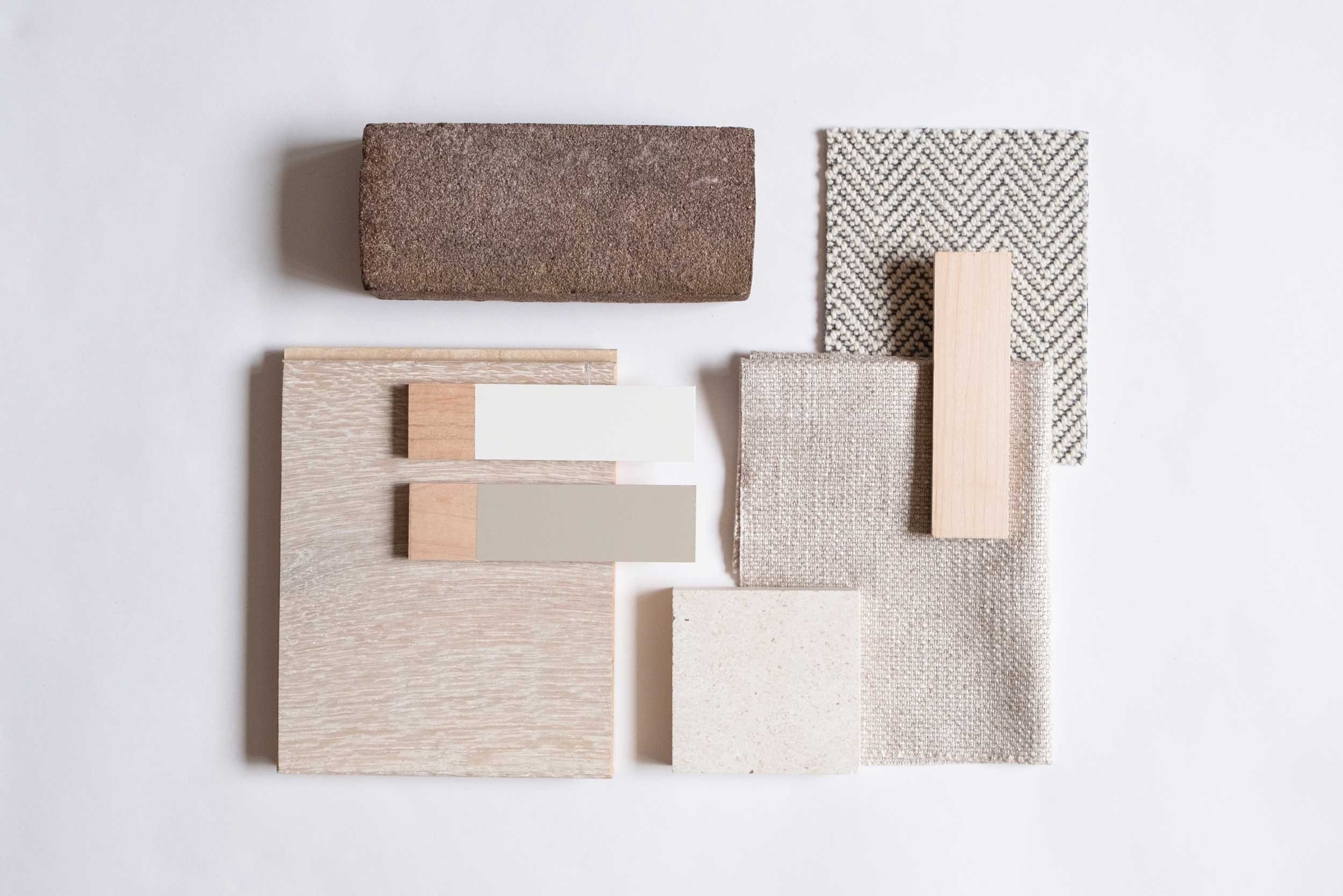
The glazed corner section offers views from the study over a well-maintained zen garden that forms a tranquil backdrop in tandem with the natural palette of materials selected internally.


In the 1930s, Reading experienced a significant increase in housing demand due to its growing population. As a result, a large number of housing estates were developed in the city during this period. The architecture of the 1930s housing in Reading is characterized by a combination of Art Deco and Modernist styles. The housing estates of this period were typically low-rise, with two or three storeys, and featured flat or pitched roofs. Many of the houses were built with red brick or rendered walls and had large windows to maximize natural light. The design often included small gardens to the front and rear of the property. Inside, the houses had a traditional layout, with separate living and dining rooms and a kitchen on the ground floor, and bedrooms and a bathroom on the upper floors. Many of the houses had original features such as fireplaces, picture rails, and wooden floors.
